


So this is apparently the logo we will be treated to for the next few months representing the Republican presidential ticket.
![]()
A few thoughts.
First…this is not a campaign logo. It’s a CORPORATE logo. It’s no wonder that many people feel that Donald Trump wants to be CEO-In-Chief rather than Commander-In-Chief.
Second…does this design give the eerie perspective that “T” is a sword through the heart of the “P”? Is that truly the image you want to be emblazoned on the minds of perspective voters?
Finally…is it just me or is it that every time I see the interlocked TP logo representing the Donald Trump/Mike Pence ticket..I think about Charmin. Just sayin’.
One should also wonder why — considering those points — when Trump officially introduced the Indiana governor as his pick for a running mate, that the new joint logo was NOT front and center on the podium.
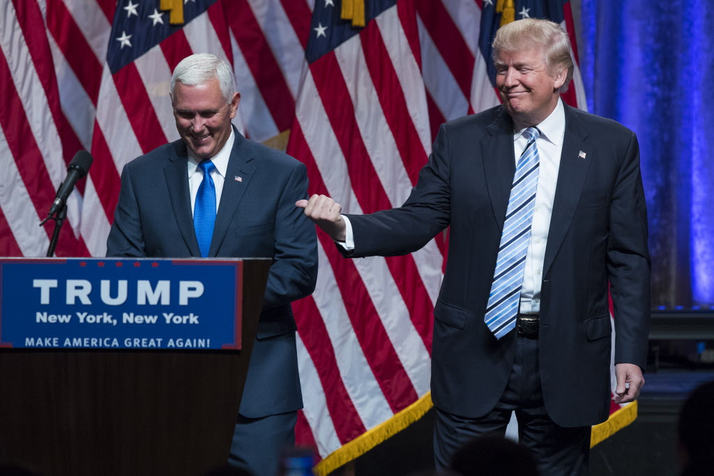
Make no mistake. Ticket or no ticket, this is still ALL about Trump.
Buckle up folks. This will only get more interesting from here.

I believe they have already dropped the upper part of the logo, and are now only using the names with slogan part. You have a polite mind to have perceived the “T” as a sword. Most saw it as either the T being an “object of flesh” penetrating the P, the P being a hand doing a job on the T, or the P as a mouth…well, you get what I mean.
LikeLike